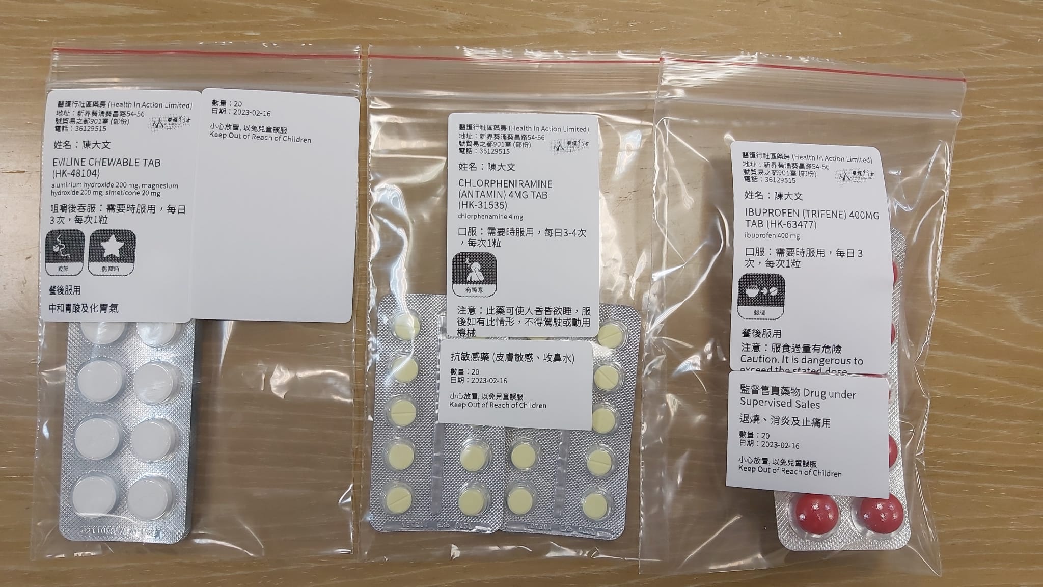
| Once a day. Twice a day. Before a meal. After a meal. At bedtime. Chew. Swallow whole. As needed. Following all the instructions for taking medications when sick can be dizzying enough — now imagine not being able to read any of it. That's something that hundreds of thousands of migrant workers, non-Chinese residents and the elderly in Hong Kong have been struggling with because they can't read Chinese or English. Their experience has prompted one social enterprise to try introducing easy-to-understand icons to drug labels. With a set of 30 drug icons covering dosage, dosing schedule, storage, route of administration and more, PharmCare hopes to improve safety around drug use by empowering patients and alleviating the burden on medical professionals. "It's like teaching people traffic signs," said founder Albert Au. Au, a chronic-disease patient himself, regularly stands in pharmacy lines to pick up his medications. There, he would see nurses meticulously go through a long list of prescriptions with older patients or their carers, sometimes using hand-drawn illustrations on pill packets to help them remember when or how to take the treatments. Not only is that process inefficient and error-prone – a study by a Hong Kong nonprofit found that elderly patients take an average of 10 pills per day – it can also be dangerous. One Pakistani pharmacist partnering with PharmCare recalled in a blog post an incident where a patient who was prescribed nitroglycerin tablets to relieve chest pain in emergency situations ended up taking them twice a day. "The consequential cost is huge," Au said. In the US, poor medication adherence costs the healthcare system an estimated $528.4 billion annually – and that's not to mention the unnecessary suffering or even lives lost. While pharmaceutical pictograms have been used around the world, there still isn't a global standard set of icons tailored for patients, according to PharmCare. Existing drug icons are either complex and intended for clinical use, or bound by copyright. American pharmacy chain CVS, for instance, has its own set of designs; in Taiwan, some hospitals print their own proprietary pictograms. In contrast, PharmCare's drug icons are open source and distributed under a Creative Commons license.  Sample pill packs illustrating how the drug icons would appear. Source: PharmCare Since debuting its drug icons, which are embedded in pharmacy-operating software also developed by PharmCare, they have been adopted by 10 pharmacies around Hong Kong. Au expects the number to grow to 80 by 2026 as part of a government initiative to establish more community pharmacies, with the ultimate goal of driving mainstream adoption. The awareness is spreading. In Singapore, researchers from Duke-NUS Medical School curated and tested a set of 35 icons and are similarly working with public healthcare institutions and pharmacies for a broader rollout. Au hopes to eventually bring the icons to other parts of Southeast Asia, where he sees a big need for more information equality. You can't put all languages on a sign, but icons – such as the men's and ladies' graphics on bathrooms – can be universal. "It turns something complex and communicates it in a simple, clear way," he told me. – Amber Tong | 

No comments:
Post a Comment