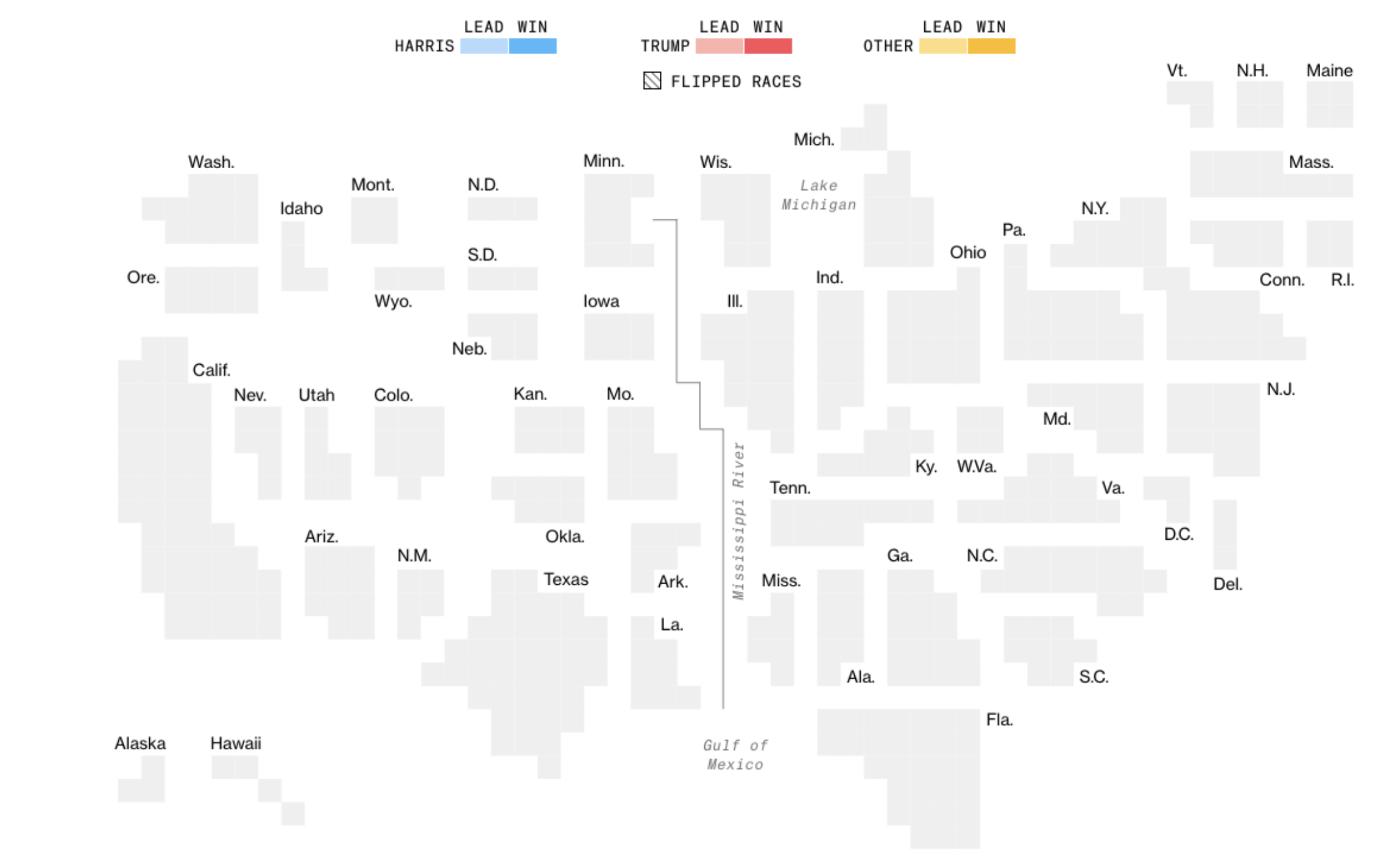
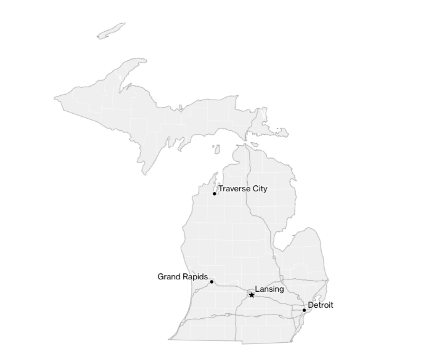
| This week's special election edition of MapLab comes from Allan James Vestal, a senior editor who works on election graphics at Bloomberg News. For many months, Bloomberg News has been preparing for one of our biggest coverage efforts every four years: the US presidential election. On November 5, our results pages will visualize up-to-the minute vote counts for presidential, congressional and gubernatorial races. We'll also be tracking key ballot measures around the country on issues such as abortion, marijuana legalization and minimum wage increases. And for the first time, we'll also be tracking how prediction markets and financial markets move alongside election results. At the heart of these efforts are maps, and specifically cartograms — maps that represent geographic areas as abstracted shapes to highlight scale. On our presidential map, each state is depicted as a bundle of squares — one square for each electoral vote that state will cast. (Our Senate and House maps similarly visualize states by their number of lawmakers.)  Bloomberg News' 2024 blank presidential cartogram, awaiting the first results. Source: Bloomberg News These cartograms highlight an important distinction: the stark differences in population density across America. Many of the areas that tend to support Republican candidates are rural and sparsely populated, while Democratic candidates often get lopsided support from denser urban areas. As my colleagues have explained in previous years, geographic maps can be misleading: large rural areas being shaded one color may create a perception of disproportionate support for one party, but people — not land area — decide elections. Bloomberg's graphics team has used cartograms in our coverage of every US election since 2018, and we've found good reasons to adjust them in each cycle. This year, for example, we rethought how we presented New York in House and presidential races to more accurately show the distribution of population in New York City and Long Island. We also enhanced representations of how Maine and Nebraska split their electoral votes. Our Senate cartogram uses triangles to show how there are two seats per state — and that one state, Nebraska, will be electing both its senators this year. Five states re-drew their House districts since the 2022 election, so we also updated that cartogram to make each square roughly align with that district's actual location within the state. Of all the election-night visuals we make, these cartograms are the linchpins. So our team pores over every detail about how we represent the country; these final cartogram designs include substantial contributions from every member of our team. But as much as geographic maps need caveats, they still play a key role in our coverage: they help readers locate things quickly. So we wanted to make the best possible versions of those, too.  Our state-level maps include geographic features that help readers pinpoint the locations they care about. Source: Bloomberg News To help our readers be able to find areas quickly using these geographic maps, we carefully chose the features to put on each state and national map. Hand-picked major cities and interstate highways serve as a proxy for population density, and major inland water features like Lake Okeechobee and Lake Pontchartrain provide added geographic reference points. This year, our real-time maps also show how each county's vote margin has shifted from 2020 to 2024. Polls and reporting suggest this is going to be an extremely close election, where the slightest of shifts may have an outsized effect on outcomes. So it's vital to be able to see where candidates have built on their parties' leads in 2020 — or where they've lost ground to the other side. Our map titled "Shifts from 2020" highlights those key differences: the taller the spike, the larger the vote share Kamala Harris or Donald Trump got in 2024 versus the share captured by Joe Biden or Trump in 2020. Meanwhile, counties with modest changes will have shallow (or even nearly flat) spikes. (Note: We only show spikes for counties that are estimated to have counted at least 95% of their votes. That minimizes the risk of incomplete data suggesting exaggerated shifts, but it means it could take a few hours before the maps get really interesting.) Our maps aim to provide readers with deep context on the ever-changing storyline that is the 2024 US election. Follow along with us as ballots are counted — and if you'd like to get notified about key updates, sign up for email alerts here. - This new map can help us heal our democracy (Washington Post)
-
Millions of movers reveal American polarization in action (New York Times) -
Google brings AI answers to map applications (Reuters) -
A lost Mayan city has been found with laser mapping (Wired) -
Seeking solace in Street View screenshots (Sixth Tone) | 


No comments:
Post a Comment